A workflow taught by Adobe Certified Instructors at Adobe Video World.
Color isn’t just decoration — it sets mood, guides attention, and tells stories. Understanding color theory turns your grading from guesswork into intentional choices that make footage feel cohesive and emotional. This guide covers the color wheel, harmonious schemes, warm and cool tones, and color psychology, so you can grade with purpose rather than by eye alone.

Why Color Theory Matters in Video
Color profoundly affects how viewers feel and what they notice, often without their awareness. A warm golden grade feels nostalgic, a cool teal one feels tense or clinical, and a vibrant palette feels energetic — color carries emotion before a single word is spoken.
Knowing color theory lets you make these effects on purpose rather than by accident. It turns color grading from pushing sliders until something looks okay into deliberately crafting the mood and focus your story needs.
Understand the Color Wheel
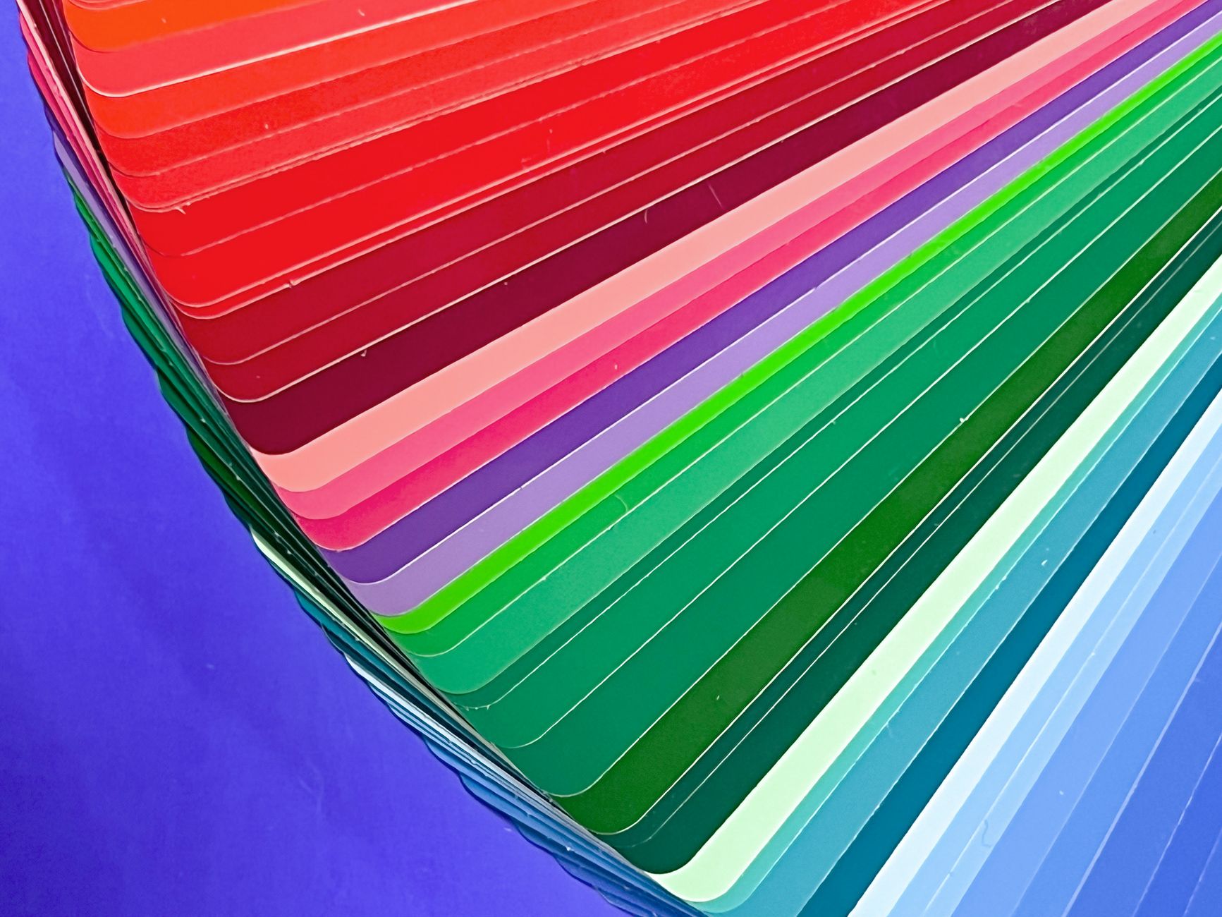
The color wheel arranges colors in a circle, showing their relationships. Colors opposite each other are complementary, those next to each other are analogous, and this map is the foundation for building harmonious, intentional color schemes.
Understanding where colors sit relative to each other explains why some combinations feel balanced and others clash. The wheel is the basic tool of color theory, and grading tools like color wheels and the vectorscope are built directly around it.

Use Complementary Colors
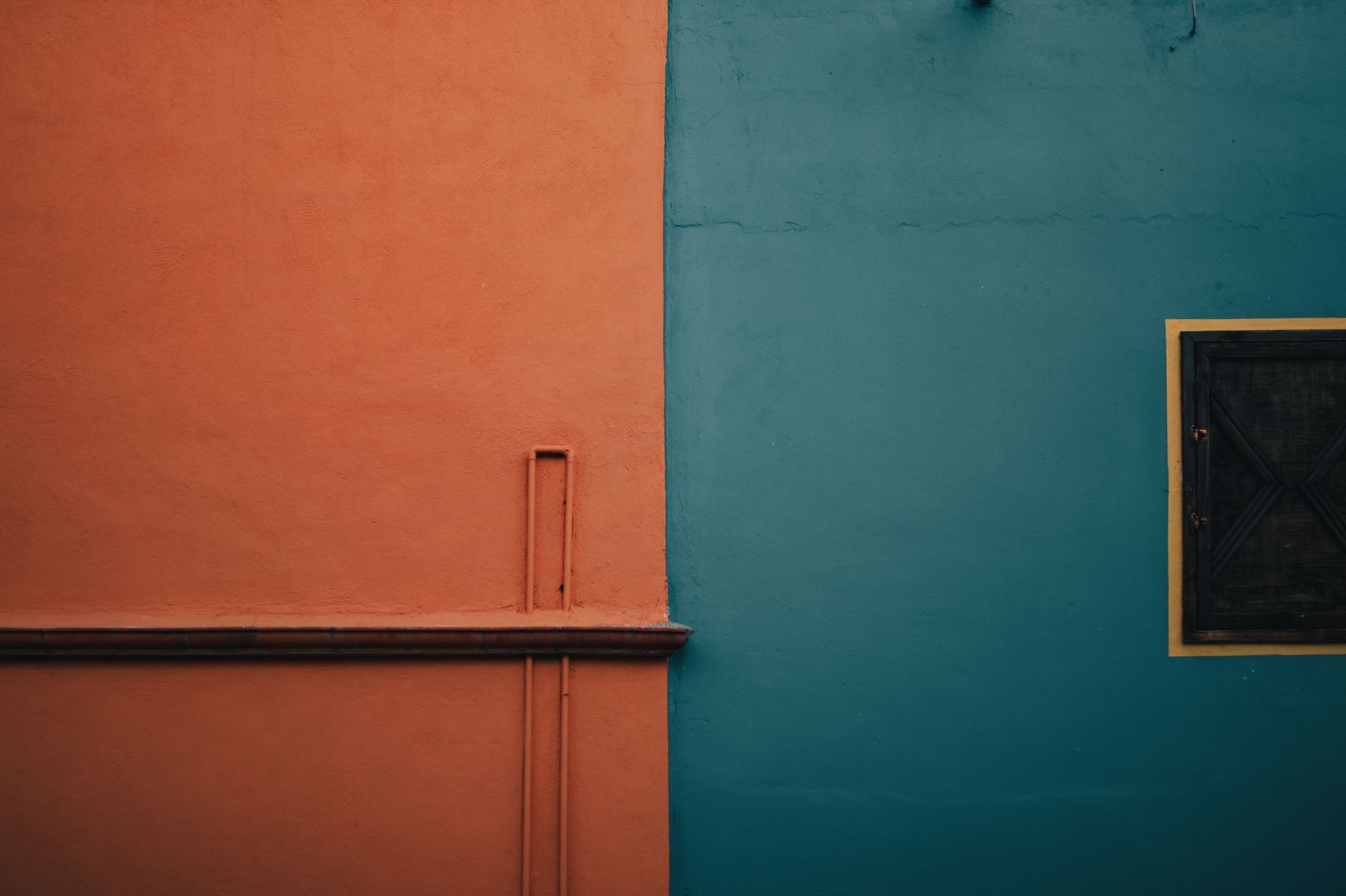
Complementary colors — opposites on the wheel, like orange and teal — create strong contrast and visual energy. The famous orange-and-teal look pairs warm skin tones against cool backgrounds, making subjects pop with cinematic contrast.
This complementary contrast is popular precisely because it’s so effective at separating subject from background. Pushing shadows toward one color and highlights toward its complement is a core grading move, giving footage a punchy, professional, film-like quality.
Work with Warm and Cool Tones
Colors divide into warm (reds, oranges, yellows) and cool (blues, greens, purples), and this temperature carries strong emotional weight. Warm tones feel inviting, energetic, and nostalgic, while cool tones feel calm, distant, or somber.
Choosing an overall temperature for a scene shapes how it feels — a warm grade for a cozy memory, a cool one for a tense night. Controlling color temperature, often via white balance and grading, is one of the most direct ways to set mood.
Apply Color Harmony Schemes
Beyond complementary, several harmony schemes guide color choices. Analogous palettes (neighboring colors) feel unified and serene, triadic palettes (three evenly spaced colors) feel vibrant and balanced, and monochromatic palettes feel cohesive and elegant.
Choosing a harmony scheme for a project gives its color a deliberate, designed feel. Whether grading footage or designing graphics, working within a harmonious palette keeps your visuals cohesive rather than a random collection of colors.
Understand Color Psychology
Colors carry psychological associations that influence emotion. Red suggests passion, danger, or urgency; blue suggests calm, trust, or sadness; green suggests nature or growth; yellow suggests happiness or caution — and these meanings shape how a scene reads.
While associations vary by culture and context, leaning into them lets you reinforce your story’s emotion. Grading a hopeful scene warmer or a fearful one colder, in line with color psychology, makes the audience feel what you intend more powerfully.
Build a Color Palette for Your Project
Cohesive videos often work from a defined palette — a small set of colors that recurs throughout. Establishing a palette for your project, in the grade and the graphics, gives it a consistent, intentional look that ties every shot together.
Many films are recognizable by their signature color palette. Deciding on yours in advance, and grading each scene toward it while allowing variation for emotional beats, gives your work the cohesive, considered feel of a designed production.
Use Color to Direct the Eye
Color guides attention, and you can use it to direct viewers within the frame. A spot of saturated color against a muted background draws the eye instantly, so emphasizing your subject’s color while toning down distractions focuses attention where you want it.
This selective use of color, achievable with the hue curves, is a powerful compositional tool. Leading the eye with color, rather than letting every element compete, is a hallmark of thoughtful, professional grading.
Color Theory Best Practices
- Use the color wheel to build harmonious schemes.
- Pair complementary colors like orange and teal for contrast.
- Choose warm or cool tones to set a scene’s mood.
- Build a consistent palette and use color to direct the eye.
Common Color Mistakes
- Grading by eye with no intentional color scheme.
- Clashing colors that fight rather than harmonize.
- Ignoring color temperature’s effect on mood.
- Letting distracting colors pull focus from the subject.
A Real Color Grading Example
Take a flat clip of a couple walking at dusk. You decide the mood is warm and nostalgic, so you push the highlights toward golden orange and let the shadows fall slightly cool teal — a complementary split that makes their warm skin tones pop against the cooling sky. The contrast separates them from the background and the warmth carries the emotion.
Then you protect the skin tones so they stay natural, and pull a distracting saturated sign in the background down toward the muted palette. Every choice serves the feeling, not just the look. That intention — grading toward a deliberate mood and palette rather than guessing — is what color theory gives you, built on the tools in our curves guide.
Study Color in Films You Love
The fastest way to internalize color theory is to study how films use it. Pausing on frames from movies you admire and asking what palette they use, where the warm and cool tones fall, and how color directs your eye trains your instincts far quicker than theory alone. Many films have a signature, recognizable color identity.
Try recreating a look you love on your own footage, matching its palette and contrast as practice. This deliberate study, combined with the hands-on skills in our color grading guide, builds the eye that lets you grade with confidence and craft your own distinctive color style over time.
Crafting a palette depends on seeing color faithfully on a calibrated monitor for video editing.
Bold, stylized color palettes give editing a music video its signature look.
Shifting toward cool, moonlit hues is the core of the day-to-night effect.
Choosing a harmonious palette guides how you push the After Effects Colorama tint effect.
Key Takeaways
- Color sets mood, guides attention, and tells stories.
- Use the color wheel and complementary pairs for contrast.
- Warm and cool tones carry strong emotional weight.
- Build a palette and use color to direct the viewer’s eye.
Frequently Asked Questions
Why is color theory important for video editing?
Color sets mood, guides attention, and reinforces storytelling, often without viewers realizing it. Understanding color theory lets you grade with intention — crafting emotion and focus on purpose rather than pushing sliders by eye.
What is the orange and teal look?
It’s a complementary color scheme pairing warm orange skin tones against cool teal backgrounds. Because orange and teal sit opposite on the color wheel, the contrast makes subjects pop with a cinematic, film-like quality.
How do warm and cool colors affect a video?
Warm tones (reds, oranges, yellows) feel inviting, energetic, and nostalgic, while cool tones (blues, greens) feel calm, distant, or somber. Choosing a scene’s color temperature is a direct way to set its emotional mood.
Sources: Wikipedia’s article on color theory.
Grade with intention at Adobe Video World
Train hands-on with Adobe Certified Instructors across 100+ Premiere Pro & After Effects sessions.