A workflow taught by Adobe Certified Instructors at Adobe Video World.
Matching shots so a scene looks consistent is a key grading skill, and Premiere’s Comparison View makes it easier by showing two clips side by side. Combined with the Color Match feature, it helps you grade footage from different angles or cameras to match. This guide covers using Comparison View to match your shots.

Why Matching Shots Matters
When you cut between shots — different angles, cameras, or times of day — they often don’t match in color and brightness, which is distracting and looks unprofessional. Matching them so the scene feels consistent is essential for a polished edit.
Shot matching ensures intercut footage looks like one cohesive scene. Without it, jarring color shifts pull the viewer out of the story, so grading clips to match, using tools like Comparison View, is a core part of professional color work.
Open Comparison View
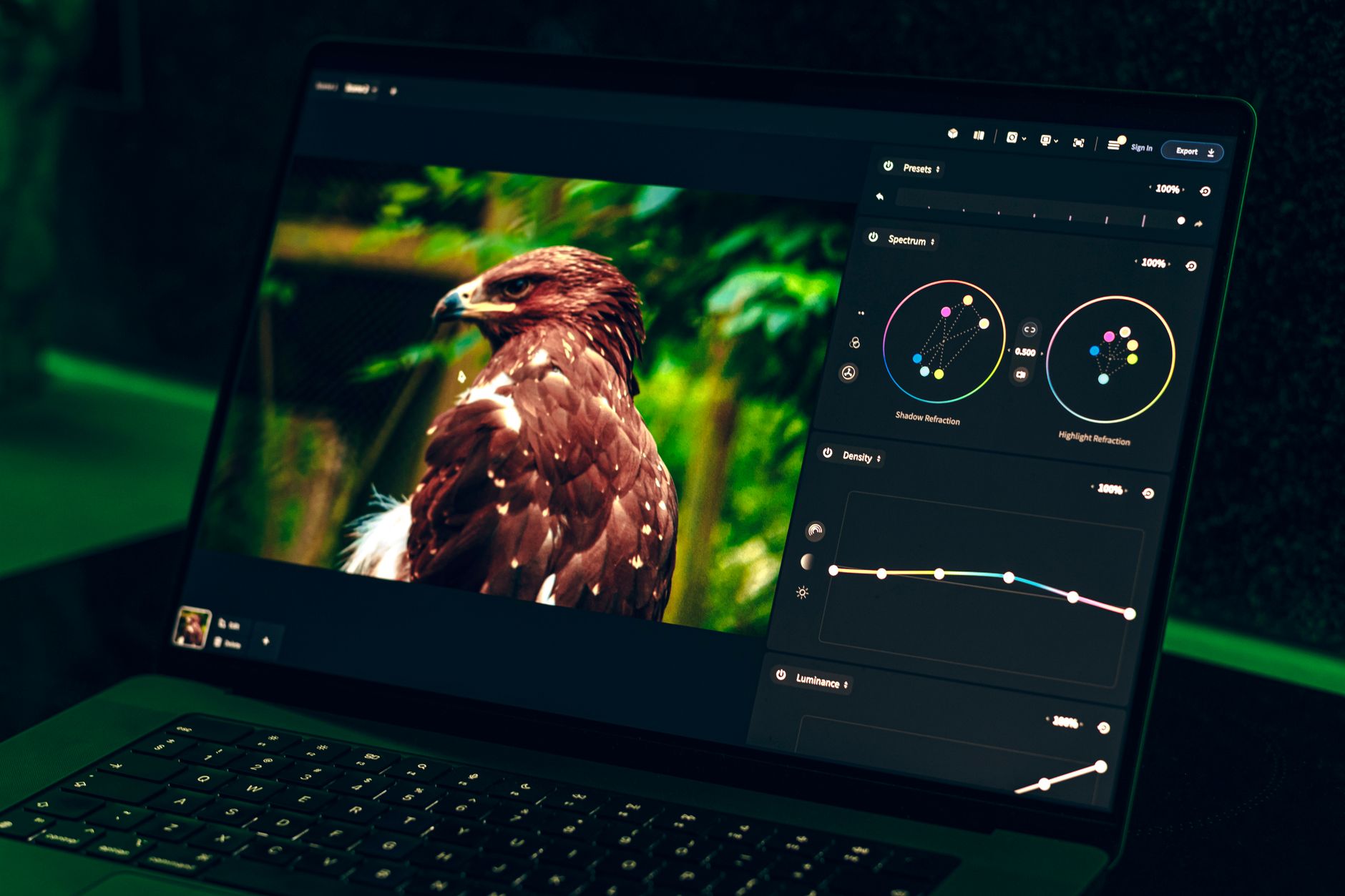
Comparison View is a Program Monitor mode that shows two frames side by side or split. Activating it lets you display the shot you’re grading next to a reference shot, so you can see exactly how they differ and need to match.
Find Comparison View in the Program Monitor’s settings or button bar. It splits the view between a reference frame and your current frame, giving you a direct visual comparison that’s far more reliable than grading from memory.
Set Your Reference and Current Frames
Comparison View has a Shot or Frame comparison. You set a reference frame — the look you want to match — and view it against your current clip, navigating to choose which shots to compare so you’re matching to the right reference.
Choosing a well-graded shot as your reference gives you a clear target. With the reference and current frames displayed together, you can grade the current clip until its color and brightness align with the reference.

Use the Color Match Feature
Premiere’s Color Match, in the Lumetri Color panel, automatically analyzes the reference and current shots and adjusts the current one to match. Clicking Apply Match brings the current clip’s color toward the reference automatically.
This automated matching, covered further in our color matching guide, gives you a strong starting point. Color Match handles the bulk of the work, getting two shots close, which you then refine by hand for a perfect match.
Refine the Match Manually
Automatic matching gets you close, but manual refinement perfects it. Comparing the shots in Comparison View, you adjust the current clip’s color wheels, curves, and exposure until it truly matches the reference across shadows, midtones, and highlights.
The side-by-side view makes these refinements precise, letting you spot remaining differences. Combining Color Match’s automatic pass with manual tweaks using the color wheels produces a seamless match that automatic matching alone may not achieve.
Use Scopes Alongside
Comparison View pairs well with the scopes. Watching the waveform and parade as you match gives you objective confirmation that the shots’ brightness and color align, beyond what your eyes perceive.
The scopes provide a technical reference to match against, complementing the visual comparison. When two shots’ scope readings align, they’re objectively matched, so using scopes alongside Comparison View ensures a reliable, accurate result.
Match Across Cameras and Lighting
Comparison View is invaluable when footage comes from different cameras or lighting conditions. Multi-camera shoots and footage shot at different times often vary significantly, and matching them is what makes the final edit feel unified.
By comparing each shot to a consistent reference, you bring varied footage into line. This is especially important for interviews and scenes cut from multiple sources, where matched color is what holds the scene together visually.
Comparison View Best Practices
- Use Comparison View to see shots side by side while grading.
- Choose a well-graded shot as your reference.
- Use Color Match for an automatic starting point.
- Refine manually and confirm with the scopes.
Common Shot Matching Mistakes
- Grading from memory instead of a side-by-side comparison.
- Relying only on automatic Color Match without refining.
- Ignoring the scopes for objective confirmation.
- Choosing a poorly-graded reference shot.
A Real Shot-Matching Example
Imagine an interview shot on two cameras that don’t match — one runs warm and slightly bright, the other cool and flat. You set the warm camera’s well-graded shot as your reference in Comparison View, switch to a cool shot, and run Color Match, which pulls it close in seconds. Then you nudge the color wheels and check the parade until both cameras’ scopes line up.
Now the edit cuts between the two angles seamlessly, as if filmed on one matched camera. That workflow — reference, automatic match, manual refinement, scope confirmation — is exactly how colorists unify multi-camera footage, and Comparison View’s side-by-side display is what makes the matching precise rather than guesswork.
Match the Whole Scene to a Hero Shot
On a scene cut from many shots, a smart approach is to grade one ‘hero’ shot to perfection, then match every other shot to it. Using that hero frame as the constant reference in Comparison View gives the whole scene a single, consistent target, so every angle and cutaway shares the same look.
This keeps a complex scene unified rather than grading each shot in isolation and hoping they agree. Combined with the workflow in our color grading guide, matching everything to one hero shot is how editors give a multi-shot sequence the cohesive, intentional color of a single, beautifully-graded image.
Match Lighting as Well as Color
Shot matching is about more than color — matching the lighting direction and contrast between shots matters too. Two clips can share the same color balance yet still feel mismatched if one is high-contrast and the other flat, so attending to contrast and brightness completes a convincing match.
Comparison View helps here, letting you see the contrast and tonal differences side by side. Adjusting not just hue but the overall light and contrast of each shot, confirmed against the scopes, is what makes intercut footage truly feel like one cohesive, consistently-lit scene.
Scrubbing between reference frames is far smoother once you understand Premiere Pro render and preview.
The split comparison view is really a special mode of the source and program monitor in Premiere Pro.
The same framing logic behind the comparison view powers a split screen effect in Premiere Pro.
Key Takeaways
- Matching shots keeps an intercut scene consistent.
- Comparison View shows two shots side by side while grading.
- Use Color Match for an automatic starting point.
- Refine manually and confirm the match with scopes.
Frequently Asked Questions
How do I use Comparison View in Premiere Pro?
Activate Comparison View in the Program Monitor to display a reference frame next to your current clip. Set a well-graded shot as the reference, then grade the current clip until its color and brightness match the reference.
What is Color Match in Premiere Pro?
Color Match, in the Lumetri Color panel, automatically analyzes a reference and a current shot and adjusts the current one to match. Clicking Apply Match brings the clip’s color toward the reference as a strong starting point.
How do I match shots from different cameras?
Use Comparison View to compare each shot to a consistent reference, apply Color Match for an automatic pass, then refine manually with the color wheels and curves, confirming the match with the scopes.
Sources: Wikipedia’s overview of color grading.
Match every shot at Adobe Video World
Train hands-on with Adobe Certified Instructors across 100+ Premiere Pro & After Effects sessions.