A workflow taught by Adobe Certified Instructors at Adobe Video World.
The frosted glass effect — a blurred, semi-transparent panel that lets the background show through softly — is a hallmark of modern UI design, known as glassmorphism. It adds depth and elegance to overlays and interfaces. After Effects creates it by blurring what’s behind a panel. This guide covers building convincing frosted glass.
What Frosted Glass Looks Like
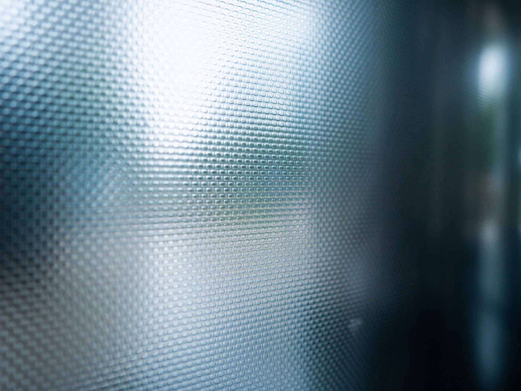
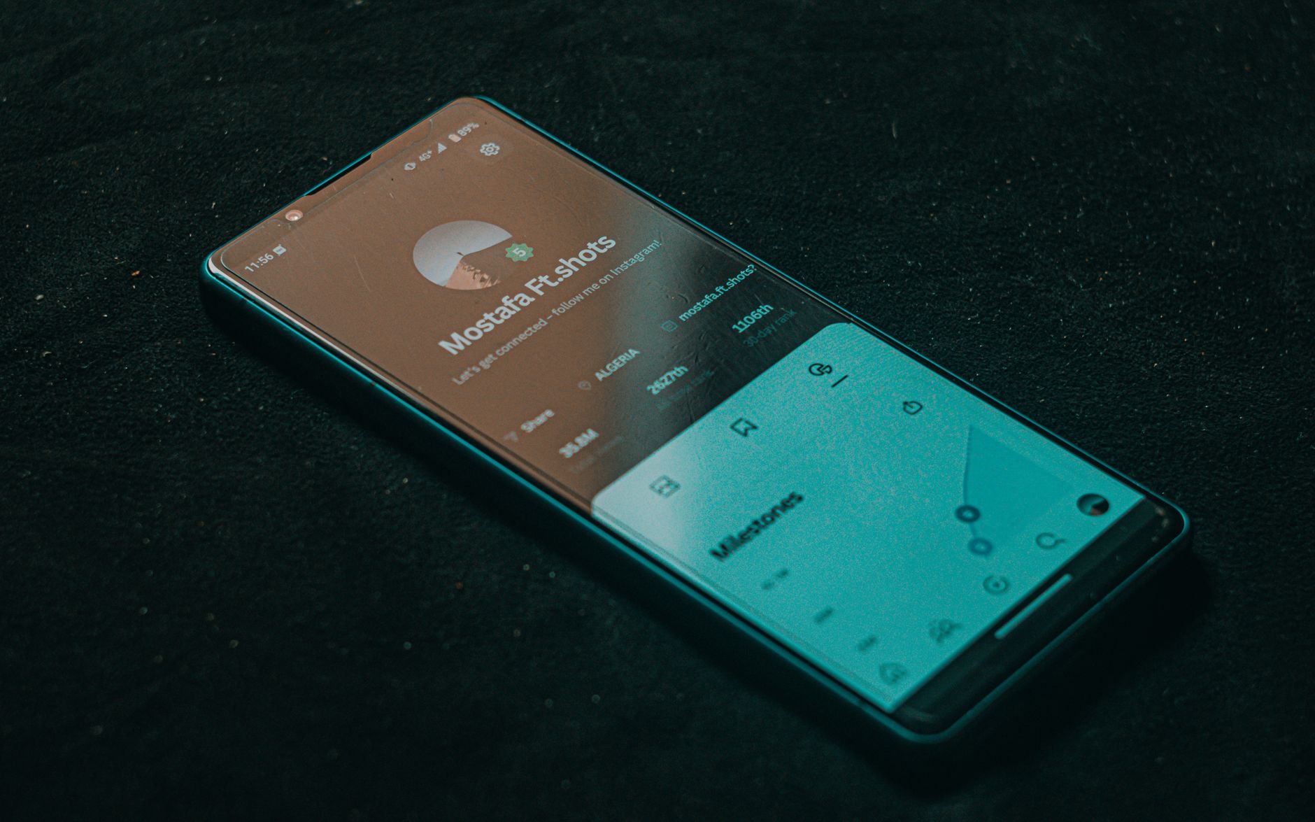
Frosted glass, or glassmorphism, is a panel that appears like translucent frosted glass — the background behind it is blurred and softened, slightly tinted, with a subtle border or highlight. It creates depth and a clean, modern, premium feel.
This effect is everywhere in contemporary UI, from operating systems to apps. The key visual is the soft, blurred view of whatever sits behind the panel, combined with light transparency, which makes the panel feel like real frosted glass.
Set Up the Background and Panel
Start with a background — an image, footage, or graphics — and a panel shape on top where the frosted glass will be. The effect works by blurring the background only within the panel’s area, so the panel reveals a softened version of what’s behind it.
Defining the panel’s shape, often a rounded rectangle, sets the area of glass. The background needs to have some content and color for the blur to soften, since frosted glass over a flat color shows little of the effect.
Blur the Background Behind the Panel
The core technique blurs the background within the panel. Duplicating the background, blurring it heavily, and masking that blur to the panel’s shape makes the area behind the glass appear softly out of focus while the rest stays sharp.
This selective blur is what creates the frosted look. Using a strong blur confined to the panel area, with the sharp background showing elsewhere, recreates the way frosted glass diffuses what’s behind it.
Add Transparency and Tint
Real frosted glass is slightly transparent and often tinted. Adding a semi-transparent fill to the panel — usually white or a light color at low opacity — over the blurred background gives it the milky, glassy quality of frosted glass.
This tint, combined with the blur, completes the translucent look. Adjusting the fill’s color and opacity controls how frosted versus clear the glass appears, letting you tune it from a faint haze to a more opaque, milky panel.
Add a Border and Highlight
Glassmorphism panels often have a subtle border or edge highlight that catches light, suggesting the edge of a glass surface. Adding a thin, light-colored stroke or a soft highlight along the top edge defines the panel and adds realism.
This edge detail makes the glass feel three-dimensional, like a real pane catching light. A faint border separates the panel from the background and reinforces the sense of a physical glass surface floating over the content.
Add Texture for Realism
For extra authenticity, a subtle texture or noise over the frosted area mimics the fine grain of real frosted glass. This slight texture breaks up the smooth blur, adding tactile realism to the surface.
Keeping the texture very subtle is key — just enough to suggest the frosted surface without being noticeable. This fine detail, combined with the blur, transparency, and edge highlight, makes the glass feel genuinely physical and refined.
Animate the Glass
Frosted glass panels can animate elegantly for UI reveals. Animating the panel sliding in, the blur building, or content appearing behind the glass creates smooth, modern motion that suits app interfaces and overlays.
These animations, eased smoothly with the techniques from our keyframe guide, give a glassmorphism interface a polished, premium feel. A panel that frosts into view as it arrives is a stylish, contemporary reveal.
Use It for UI and Overlays
Frosted glass shines for interface mockups, lower thirds, and overlays where you want content to sit over a busy background while staying readable. The blur behind the panel keeps text legible while letting the background show through softly.
This makes it both beautiful and functional, which is why glassmorphism is so popular. Using frosted panels for titles and UI over motion graphics gives a modern, depth-rich look that flat overlays can’t match.
Frosted Glass Best Practices
- Blur the background only within the panel’s shape.
- Add a semi-transparent light tint for the glassy look.
- Add a subtle border or edge highlight for realism.
- Use it over busy backgrounds to keep content readable.
Common Frosted Glass Mistakes
- Too little blur, so the glass doesn’t frost the background.
- A flat background with nothing for the blur to soften.
- No tint or border, leaving it looking like a plain blur.
- Heavy texture that overwhelms the smooth glass look.
A Real Frosted Glass Example
Picture designing a sleek app promo where a settings panel slides over a colorful background. You duplicate the vibrant background, blur it heavily, and mask that blur to a rounded-rectangle panel, then lay a white fill at low opacity over it so the colors beneath glow softly through the frosted surface. A thin light border and a faint highlight along the top edge define the glass.
As the panel slides in and the blur builds, the background’s color bleeds through in soft, diffused tones, and the white text on the panel stays perfectly readable. That combination of confined blur, light tint, and edge highlight is exactly what gives glassmorphism its modern, premium, depth-rich feel.
Glassmorphism in Context
Frosted glass works best when there’s rich, colorful content behind it for the blur to soften, which is why it shines over photography, gradients, and vibrant motion graphics rather than flat backgrounds. The interplay between the sharp panel and the diffused color beneath is what creates the sense of real, layered depth.
Used thoughtfully, glassmorphism keeps overlays and UI readable while letting the background’s energy show through, a balance flat panels can’t achieve. Pairing frosted glass with a cohesive color palette and clean typography gives interfaces and titles a contemporary, polished look that feels current and premium across apps, promos, and motion design.
Blending two images is the heart of both looks, so a double exposure effect in After Effects shares the blend-mode thinking behind frosted glass.
Pairing a soft glass blur with creating a VHS retro look in After Effects sells a worn, dreamy vintage aesthetic.
Glassy, translucent surfaces feed naturally into the After Effects hologram effect.
Those translucent panels start with creating a HUD interface in After Effects before you add the glowing elements.
Key Takeaways
- Frosted glass blurs the background behind a translucent panel.
- Confine a strong blur to the panel’s shape.
- Add a light tint, an edge highlight, and subtle texture.
- Use it for modern UI and readable overlays.
Frequently Asked Questions
How do I create a frosted glass effect in After Effects?
Duplicate your background, blur it heavily, and mask the blur to a panel shape so the area behind the glass is softened. Add a semi-transparent light tint over it, plus a subtle border and texture, for the frosted look.
What is glassmorphism?
Glassmorphism is a design style using frosted glass panels — blurred, semi-transparent surfaces that let the background show through softly, with a subtle border. It creates depth and a clean, modern, premium feel in UI.
Why doesn’t my frosted glass effect show up?
Frosted glass needs a background with content and color for the blur to soften. Over a flat color it shows little effect. Make sure the background has detail, and use a strong enough blur within the panel area.
Sources: Wikipedia’s overview of frosted glass.
Design modern UI at Adobe Video World
Train hands-on with Adobe Certified Instructors across 100+ Premiere Pro & After Effects sessions.