A workflow taught by Adobe Certified Instructors at Adobe Video World.
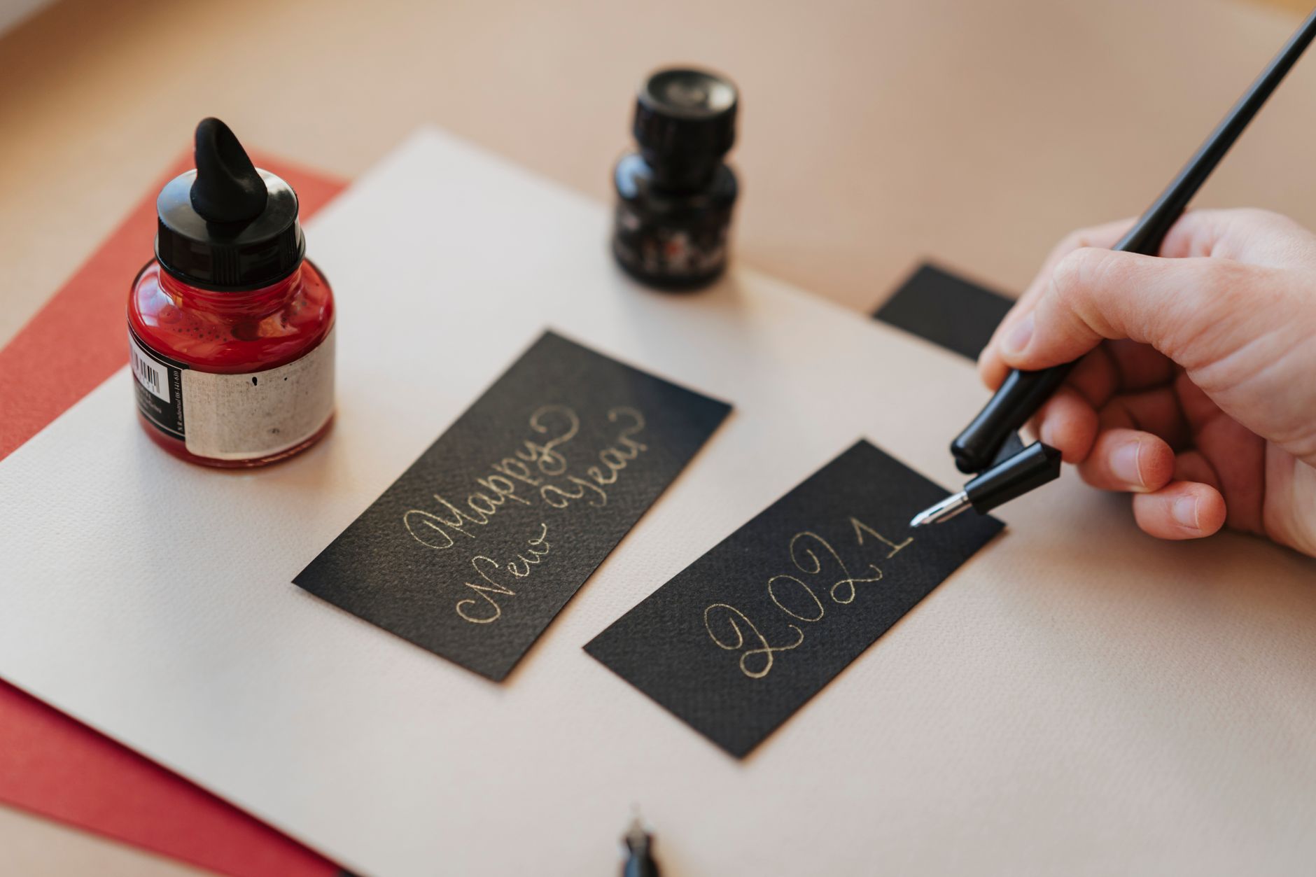
The write-on effect makes text or a signature appear as though it’s being written by hand, stroke by stroke. It’s perfect for signatures, handwritten titles, and personal, organic reveals. After Effects offers a dedicated Write-on effect and a Trim Paths method, each with its strengths. This guide covers both approaches and how to make the handwriting look authentic.
What the Write-On Effect Is
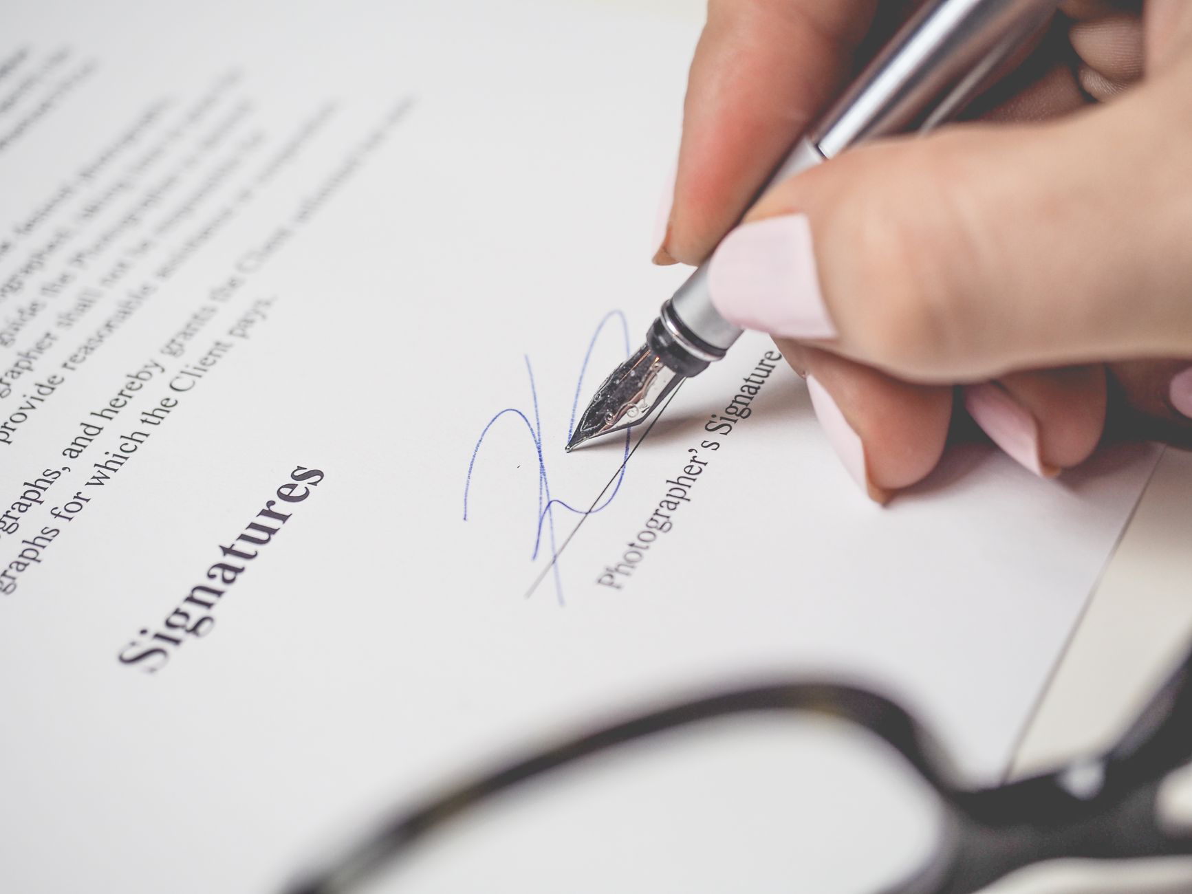
A write-on effect reveals text or artwork along the natural path a hand would take to draw it, so letters appear to be written in real time. Unlike a simple fade or typewriter reveal, it follows the actual strokes of the handwriting.
This makes it ideal for signatures, handwritten messages, and personal, warm reveals that a mechanical effect can’t deliver. The hand-drawn quality adds authenticity, which is why it’s popular for wedding videos, personal brands, and storytelling.
Use the Write-on Effect
After Effects has a built-in Write-on effect under Generate. Applied to a layer, it reveals content along a path you define by keyframing a brush position, so the reveal follows wherever you move the brush over time.
You keyframe the Brush Position to trace the shape of the letters frame by frame, and the effect paints them on as you go. It takes patience to animate the path, but it gives a genuine hand-drawn stroke order that looks authentic.
Keyframe the Brush Position
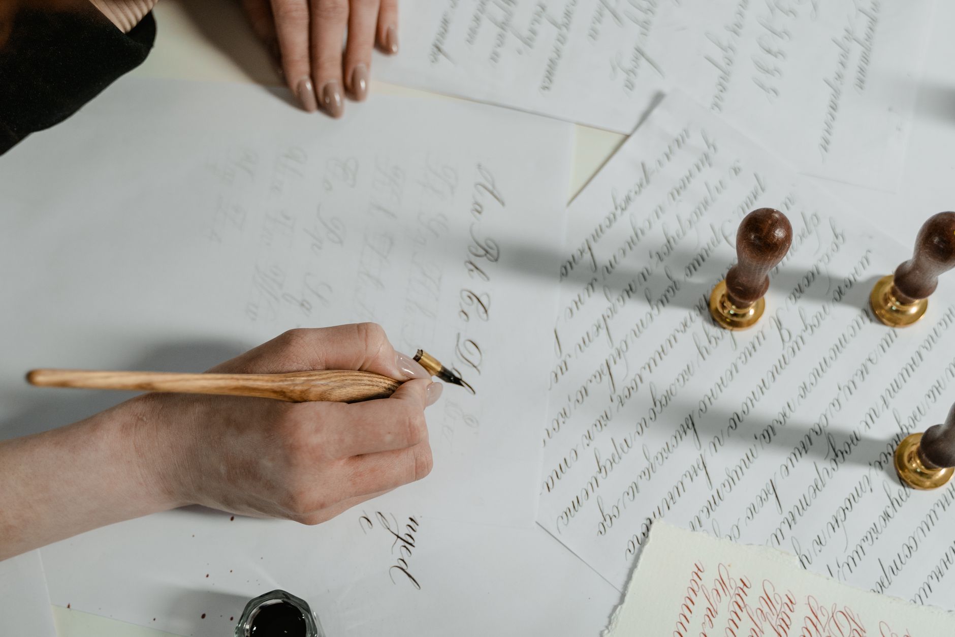
The core of the Write-on effect is animating the Brush Position to follow your handwriting. Step through the clip setting position keyframes along the path of each letter, as if your cursor were the pen tip moving through the strokes.
Setting keyframes closely along curves and corners keeps the reveal smooth and accurate. This manual tracing is what gives the effect its natural order, since you’re literally defining the route the ‘pen’ takes across the text.
Adjust Brush Size and Spacing
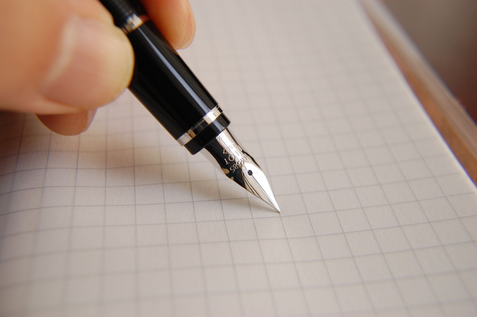
The Write-on effect’s brush settings shape the result. Set the Brush Size to match the thickness of your text or artwork so the reveal fully covers it, and adjust spacing and hardness for a clean, continuous stroke.
If the brush is too small, parts of the letters won’t reveal; too large and it spills outside them. Matching the brush to your text’s stroke width ensures the writing appears crisply and completely as the animation plays.
Use Trim Paths as an Alternative
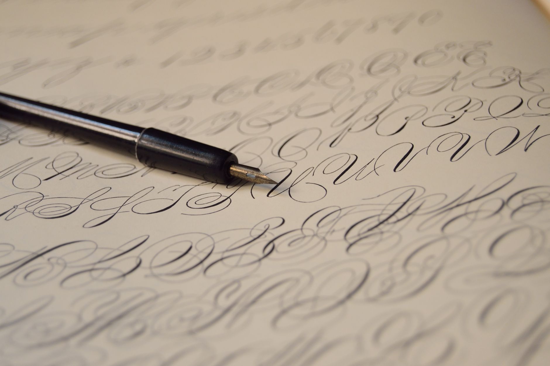
A popular alternative is the Trim Paths method. Trace your text or signature as stroked shape paths, then animate Trim Paths’ End from 0 to 100%, and the strokes draw themselves on along their paths.
Trim Paths is often cleaner and easier to control than the Write-on effect for vector outlines, especially for logos and lettering you can trace as shapes. Many artists prefer it for its precision, reserving the Write-on effect for textured, brush-style reveals.
Reveal Real Handwriting Footage
Another approach uses footage or a still of actual handwriting. Film or scan handwriting, then use a Write-on or Trim Paths matte to reveal the real ink progressively, combining authentic handwriting with animated timing.
This gives the most genuine result, since the handwriting itself is real. Using a track matte to reveal the footage, as our track mattes guide describes, lets you animate real ink appearing exactly as if it were being written.
Time It Like Real Writing
Authentic handwriting has rhythm — faster on simple strokes, slower on intricate ones, with tiny pauses between letters and words. Vary your animation speed to match this rather than revealing at a perfectly even pace, which looks mechanical.
Easing the reveal and adding natural timing variation, drawing on our keyframe guide, sells the illusion that a hand is writing. These small imperfections in timing are what make the effect feel real rather than computer-generated.
Add a Pen or Marker
For extra realism, add a visible pen, brush, or marker tip that follows the writing. Animate a pen graphic so its tip stays at the leading edge of the reveal, and it looks as though the pen itself is drawing the strokes.
Parenting the pen to the reveal point, or animating it along the same path, ties the tool to the writing convincingly. This finishing touch turns an abstract write-on into a believable scene of something being actively drawn.
Write-On Effect Best Practices
- Use the Write-on effect by keyframing the Brush Position along the strokes.
- Match the brush size to your text’s thickness.
- Use Trim Paths for clean vector lettering and signatures.
- Vary the timing to mimic real handwriting rhythm.
Common Write-On Mistakes
- A brush too small or large, revealing text unevenly.
- Revealing at a perfectly even, mechanical pace.
- Tracing the wrong stroke order, so writing looks unnatural.
- Forgetting a pen tip that would sell the effect.
A Real Signature Write-On Example
Imagine ending a wedding film with the couple’s names appearing as if signed by hand. You trace each name as stroked shape paths following the real pen strokes, add Trim Paths, and animate the End of each letter in sequence, easing them and varying the speed so loops draw slower than straight lines.
Then you place a small pen graphic at the leading edge of the writing so it looks like the pen is forming the letters. The names flow onto the screen with a warm, personal, handwritten feel that no fade could match — exactly the kind of heartfelt touch the write-on effect is made for.
Write-On for Educational Videos
The write-on effect is a staple of teaching and explainer content, where diagrams and notes appear to be drawn live as the narrator speaks. Animating arrows, circles, and handwritten labels onto a whiteboard-style background makes lessons feel dynamic and keeps viewers following along with each point as it’s revealed.
Timing each element to draw on exactly when the narration reaches it is what makes this style work. Built with Trim Paths and synced carefully to the voiceover, write-on animations turn static explanations into engaging, hand-crafted lessons, a technique that pairs naturally with the wider motion graphics toolkit.
After animating text on, a countdown timer in After Effects drives numbers automatically with a simple expression.
Like a write-on, creating a radial wipe in After Effects reveals content progressively, but in a clean circular sweep.
Animated drawn elements complement the After Effects character animation workflow for an illustrated, hand-made style.
Key Takeaways
- A write-on effect reveals text as if written by hand.
- Use the Write-on effect’s Brush Position or Trim Paths.
- Match brush size to text and trace the natural stroke order.
- Vary the timing and add a pen tip for authenticity.
Frequently Asked Questions
How do I create a write-on effect in After Effects?
Apply the built-in Write-on effect and keyframe the Brush Position to trace the strokes of your text, matching the brush size to its thickness. Alternatively, use Trim Paths on stroked shape paths for clean vector lettering.
Should I use the Write-on effect or Trim Paths?
Trim Paths is cleaner and easier for vector outlines like logos and signatures, while the Write-on effect suits textured, brush-style reveals. Many artists prefer Trim Paths for precision and the Write-on effect for organic strokes.
How do I make handwriting animation look real?
Trace the natural stroke order, vary the speed so it’s faster on simple strokes and slower on intricate ones, ease the reveal, and add a visible pen tip that follows the writing for extra realism.
Sources: Adobe’s documentation on the Write-on and generate effects in After Effects.
Animate handwriting at Adobe Video World
Train hands-on with Adobe Certified Instructors across 100+ Premiere Pro & After Effects sessions.