A workflow taught by Adobe Certified Instructors at Adobe Video World.
Your thumbnail is the single biggest factor in whether people click your video, making it as important as the content itself. Photoshop is the go-to tool for designing eye-catching, professional thumbnails. This guide covers creating YouTube thumbnails that stand out, communicate clearly, and earn the clicks that grow your channel.

Why Thumbnails Matter So Much
On YouTube and social platforms, your thumbnail competes for attention in a sea of options. A compelling thumbnail can dramatically increase clicks, while a weak one buries great content, making the thumbnail one of the highest-impact things you create.
Because click-through rate strongly affects how a video performs, investing in thumbnails pays off enormously. A great thumbnail draws viewers in and communicates what the video offers, which is why creators treat thumbnail design as a critical skill.
Set Up Your Thumbnail Document
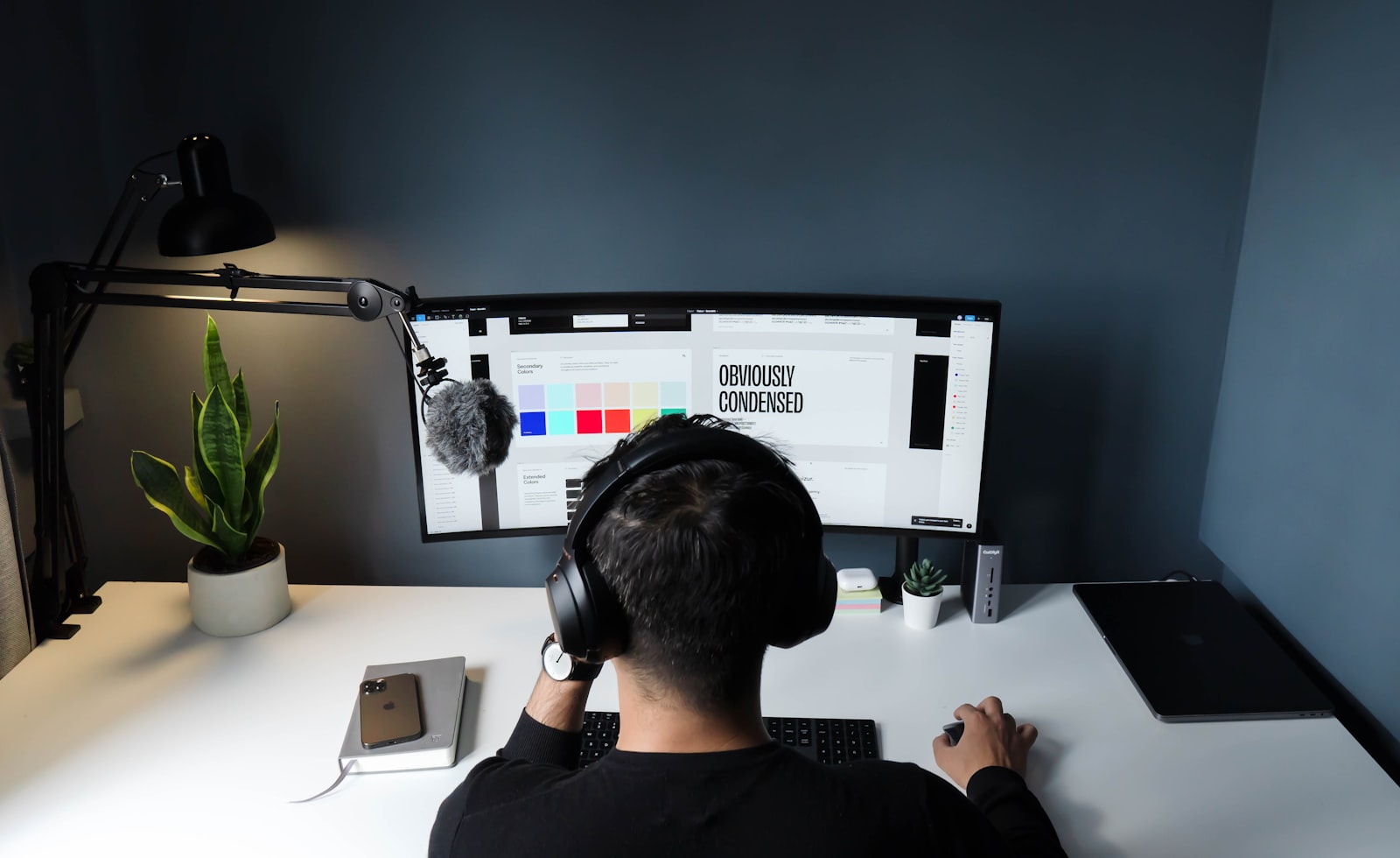
Start with the right canvas. YouTube thumbnails are 1280×720 pixels (16:9), so create a Photoshop document at that size, which ensures your thumbnail displays crisply at the platform’s dimensions.
Working at the correct resolution from the start avoids quality issues. Setting up a 1280×720 document gives you the right canvas to design on, and keeping the file under YouTube’s size limit ensures it uploads cleanly.
Start with a Strong Image
A great thumbnail begins with a strong base image — often a high-quality still frame from your video or a shot taken for the thumbnail. An expressive face, a striking moment, or a clear subject grabs attention.
Faces with strong expressions are especially effective, as viewers respond to them. Starting from a clean, high-resolution, eye-catching image, rather than a dull or low-quality one, gives your thumbnail the compelling foundation it needs.

Use Bold, Readable Text
Thumbnail text must be bold and readable at small sizes, since thumbnails are often viewed tiny on phones. Using large, heavy fonts, just a few words, and high contrast ensures the text reads instantly at any size.
Keep the text short and punchy — a few impactful words, not a sentence. Adding a stroke or shadow so the text pops from the background, and keeping the font large and bold, ensures your message is legible even on a small screen.

Make It High Contrast
Thumbnails that pop use strong contrast — bright colors, clear separation between elements, and a subject that stands out from the background. High contrast catches the eye in a crowded feed where subtle designs disappear.
Using vibrant, contrasting colors and ensuring your subject separates clearly from the background, sometimes by cutting them out and placing them on a bold backdrop, makes the thumbnail visually striking. Contrast is what stops the scroll.
Keep the Composition Clear
A cluttered thumbnail confuses, so keep it simple and clear. Focusing on one main subject, one clear message, and an uncluttered composition communicates instantly, which is essential at thumbnail size.
Viewers decide in a split second, so the thumbnail must read at a glance. Avoiding clutter, emphasizing a single focal point, and leaving the design clean ensures your thumbnail communicates clearly rather than overwhelming the viewer with detail.
Cut Out Subjects Cleanly
A common technique cuts out the subject and places them on a custom background. Using Photoshop’s selection tools to cleanly extract a person or object, then compositing them onto a bold backdrop, creates a polished, eye-catching thumbnail.
This separation lets you control the background and make the subject pop. Clean cutouts, with refined edges around hair and detail, are a hallmark of professional thumbnails, giving you full control over the composition and contrast.
Stay Consistent and Honest
Consistency builds your brand — using recurring fonts, colors, and styles makes your thumbnails recognizable as yours. And honesty matters: the thumbnail should represent the video, since misleading clickbait erodes trust and hurts long-term growth.
A consistent thumbnail style helps viewers recognize your content, while an accurate one keeps the trust that brings them back. Balancing eye-catching design with honest representation, and a recognizable style, is what makes thumbnails that grow a channel sustainably.
Thumbnail Design Best Practices
- Design at 1280×720 with a strong, expressive base image.
- Use bold, readable text with just a few words.
- Make it high contrast so it pops in the feed.
- Keep the composition clear and the style consistent.
Common Thumbnail Mistakes
- Text too small or thin to read at thumbnail size.
- Cluttered designs that don’t read at a glance.
- Low contrast that disappears in the feed.
- Misleading clickbait that erodes viewer trust.
A Real Thumbnail Design Example
Picture designing a thumbnail for a cooking video. You open a 1280×720 canvas, drop in a high-resolution still of the finished dish, and cut out the chef’s surprised face to place on one side. Three bold words — ‘EASIEST DINNER EVER’ — in a heavy font with a thick stroke fill the other side, and a vivid color block behind the chef makes them pop.
Everything reads instantly even at tiny phone size, and the expressive face plus the bold promise practically demand a click. That combination of a strong image, a cut-out face, bold readable text, and high contrast is exactly the formula that turns a thumbnail into the deciding factor in whether a video gets watched.
Test and Iterate on Thumbnails
Thumbnail design improves through testing. Comparing different thumbnail concepts, watching which earn higher click-through rates, and studying the thumbnails of successful videos in your niche all sharpen your instinct for what makes people click, turning guesswork into a repeatable, data-informed skill.
Many creators design several options and A/B test them, refining based on real performance rather than assumptions. This iterative habit, combined with a consistent, recognizable style, steadily raises your click-through rate over time — and pairing strong thumbnails with the broader strategy in our YouTube workflow guide is how creators turn good content into well-watched content.
A scroll-stopping thumbnail is only half the battle; the other half is optimizing your videos for YouTube search.
The same branding mindset behind a thumbnail applies to adding a watermark in Premiere Pro on your footage.
Photoshop does more than stills; editing video in Photoshop handles short clips, frames, and animation right in the same app.
Key Takeaways
- The thumbnail is a top factor in whether people click.
- Start from a strong image and use bold, readable text.
- Make it high contrast with a clear, simple composition.
- Stay consistent and represent the video honestly.
Frequently Asked Questions
How do I make a YouTube thumbnail in Photoshop?
Create a 1280×720 document, start with a strong, expressive base image (often a still from your video), add bold readable text with just a few words, make it high contrast, keep the composition clear, and cut out subjects cleanly for a polished look.
What size should a YouTube thumbnail be?
YouTube thumbnails are 1280×720 pixels (16:9 aspect ratio). Design at that resolution so the thumbnail displays crisply, and keep the file under YouTube’s size limit so it uploads cleanly.
What makes a good YouTube thumbnail?
A strong, expressive image (often a face), bold readable text with just a few words, high contrast that pops in the feed, a clear uncluttered composition, a consistent recognizable style, and honest representation of the video.
Sources: Wikipedia’s overview of the thumbnail.
Design thumbnails that get clicks at Adobe Video World
Train hands-on with Adobe Certified Instructors across 100+ Premiere Pro & After Effects sessions.