A workflow taught by Adobe Certified Instructors at Adobe Video World.
A lower third is the name-and-title graphic that appears in the lower portion of the screen to introduce a speaker. It’s a staple of interviews, documentaries, and news, and Premiere Pro builds them quickly with the Essential Graphics panel. This guide covers creating, styling, and animating lower thirds, plus saving them as reusable templates.

What a Lower Third Is
A lower third is a text graphic in the lower area of the frame, traditionally showing a person’s name on one line and their title or role beneath. It identifies who’s speaking without interrupting the footage, which is why interviews rely on it.
Beyond names, lower thirds display locations, topics, and other context. The name comes from its position — the lower third of the screen — and getting them clean and consistent is a hallmark of professional video.
Create Text with the Type Tool
The simplest start is the Type tool. Select it, click in the lower portion of your frame, and type the person’s name, then create a second text layer beneath for their title or role.
Each piece of text becomes a graphic clip on your timeline that you can style and position. Building the name and title as separate text layers gives you independent control over each, which helps with styling and alignment.
Use the Essential Graphics Panel
The Essential Graphics panel (Window > Essential Graphics) is where you refine your lower third. Its Edit tab gives you full control over font, size, color, alignment, and position for each text layer in your graphic.
This panel is the hub for designing titles in Premiere, and it’s also where you’ll find ready-made lower-third templates to customize, much like the Motion Graphics templates covered separately. Working here keeps all your text controls in one place.
Style Your Lower Third
Good styling makes a lower third readable and on-brand. Choose a clean font, set a clear size hierarchy with the name larger than the title, and ensure strong contrast against the footage, often with a subtle background bar or shadow behind the text.
Consistency is key — use the same fonts, colors, and placement for every lower third in a project. Drawing on our titles guide, a clean, consistent style is what separates professional lower thirds from ones that look thrown together.
Add a Background Shape
Text alone can get lost over busy footage, so many lower thirds include a background. Add a rectangle or bar behind the text using the shape tools in Essential Graphics, giving the words a solid base that keeps them legible over any background.
A semi-transparent bar or a solid brand-colored shape both work well. This background, sized to frame the text neatly, ensures your lower third stays readable whether it appears over a bright sky or a dark interior.
Animate It On and Off
A polished lower third animates in rather than popping on. Keyframe the graphic’s position or opacity so it slides or fades in, holds while the person is introduced, then animates out, giving it a smooth, professional entrance and exit.
Essential Graphics also offers built-in responsive animation controls for some templates. Either way, easing the animation with the techniques from our keyframe guide makes the lower third glide gracefully instead of appearing abruptly.
Save It as a Reusable Template
Once you’ve built a lower third you like, save it to reuse. You can export your graphic as a Motion Graphics template, so you drop it onto future clips and just change the text, keeping every name graphic consistent across a project.
This reusability is a huge time-saver on interview-heavy work with many speakers. Build the design once, save it, and every subsequent lower third becomes a matter of typing a name, with the styling and animation already perfected.
Keep Lower Thirds Readable
The whole point of a lower third is to be read quickly, so readability rules. Keep text large enough, ensure strong contrast, leave it on screen long enough to read comfortably, and don’t clutter it with too much information.
Place it within the safe margins so it isn’t cut off on any screen, and avoid covering important action in the frame. A lower third that’s clear, well-timed, and unobtrusive does its job perfectly, which is exactly what you want.
Lower Thirds Best Practices
- Build the name and title as separate text layers.
- Style them consistently with clear hierarchy and contrast.
- Add a background shape so text stays readable.
- Animate them on and off, and save a reusable template.
Common Lower Third Mistakes
- Low contrast that makes the text hard to read.
- Inconsistent fonts or placement between speakers.
- Text popping on abruptly with no animation.
- Leaving it on too briefly to read comfortably.
A Real Lower Third Example
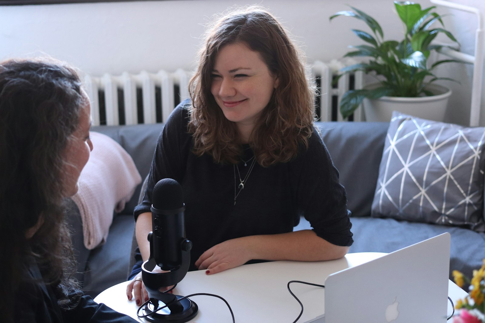
Imagine introducing a guest in a podcast video. You type their name in a bold clean font and their role, ‘Marketing Director,’ smaller beneath it, then drop a semi-transparent dark bar behind both lines so the text reads clearly over the busy studio background. A short slide-and-fade brings it in from the left as they start speaking.
It holds for four seconds — long enough to read comfortably — then slides out. Saved as a template, the next guest’s lower third is just a name change away, and every introduction across the series matches perfectly. That blend of clean design, readability, and consistency is exactly what a professional lower third delivers.
Animated and On-Brand Lower Thirds
Lower thirds are a prime branding opportunity, so tying their design to your visual identity strengthens every video. Using your brand colors for the background bar, your chosen fonts for the text, and a consistent animation style makes each name graphic reinforce your channel or company’s look the moment it appears.
A small accent — a colored line, a logo mark, a signature motion — can make your lower thirds instantly recognizable as yours. Built once as a branded template and reused throughout, as our templates guide describes, these graphics turn a functional title into a consistent piece of your brand.
Beyond name graphics, the Track Matte Key for revealing footage inside text is a striking way to build animated titles in Premiere.
On-screen labels and callouts support an explainer video edit by reinforcing each point visually.
Score overlays and player name labels are part of gaming video editing.
Beyond static name graphics, using text animation presets in Premiere Pro add quick, polished motion to any text.
Key Takeaways
- A lower third introduces a speaker with a name and title.
- Build and style it in the Essential Graphics panel.
- Add a background shape and animate it on and off.
- Save it as a template to keep every name graphic consistent.
Frequently Asked Questions
How do I create a lower third in Premiere Pro?
Use the Type tool to add the person’s name and title as text layers in the lower part of the frame, then refine the font, size, color, and position in the Essential Graphics panel’s Edit tab.
How do I make a lower third readable over footage?
Add a background shape — a semi-transparent bar or solid brand-colored rectangle — behind the text, use strong contrast, and keep the font large enough. This keeps the lower third legible over any background.
Can I reuse a lower third in Premiere Pro?
Yes. Export your finished lower third as a Motion Graphics template, then drop it onto future clips and simply change the text. This keeps every name graphic consistent and saves time on interview-heavy projects.
Sources: Wikipedia’s article on the lower third.
Title like a broadcaster at Adobe Video World
Train hands-on with Adobe Certified Instructors across 100+ Premiere Pro & After Effects sessions.