A workflow taught by Adobe Certified Instructors at Adobe Video World.
A lower third is the name-and-title graphic that slides in during interviews, news, and documentaries. Built well, it looks broadcast-professional; built carelessly, it screams amateur. After Effects gives you complete control to design and animate one from scratch — here’s the full workflow.
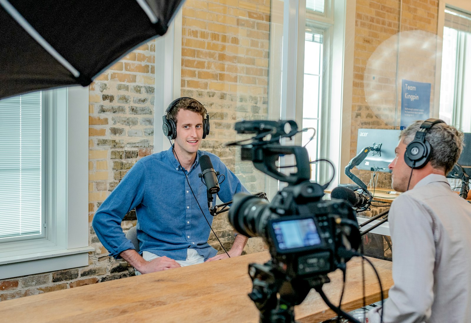
What a Lower Third Is
A lower third sits in the lower portion of the frame and identifies a speaker, location, or topic. It typically pairs a larger primary line — usually a person’s name — with a smaller secondary line for their role or company, often over a colored bar or shape.
The name comes from its position: the bottom third of the screen, where it stays clear of faces and the action above. Because it’s a recurring branded element, it pays to design one well and reuse it.
Set Up Your Composition
Start with Composition > New Composition sized to match your video — 1920×1080 at 24 or 30 frames per second for most projects. Keep the duration short, around five seconds, since a lower third only needs to animate on, hold, and animate off.
Turn on the title-safe guides (right-click the Composition panel) so you keep your graphic inside the area that won’t be cropped on different screens. A few seconds of setup here prevents reformatting headaches later.
Add the Name and Title Text
Grab the Type tool and create two separate text layers: a bold, larger line for the name and a lighter, smaller line for the title beneath it. Keeping them on separate layers lets you animate and style each independently.
Choose a clean sans-serif font, give the name strong weight, and set generous spacing between the two lines. Clear visual hierarchy — big name, small role — is what makes a lower third instantly readable.
Build a Background Bar
Add a shape layer behind the text with the rectangle tool to create a bar or panel. A solid or semi-transparent bar guarantees your text stays legible no matter what’s behind it in the footage.
Match the bar’s color to your brand, and consider a subtle accent line or a second shape for visual interest. Position everything together in the lower-left or lower-right, leaving a comfortable margin from the edge of the frame.

Animate the Bar On
Now bring it to life. Keyframe the bar’s Scale to grow from zero to full width, anchoring it so it expands from one side rather than the center — a classic wipe-on reveal.
Set a keyframe at the start with the bar collapsed and another fifteen frames later at full size. After Effects animates the bar sweeping open, which feels far more dynamic than simply fading it in.
Reveal the Text
Stagger the text so it appears just after the bar finishes opening. Keyframe each text layer’s Position to slide up into place and its Opacity to fade in over a few frames.
Offset the title line a couple of frames behind the name so they cascade rather than appearing at once. This small overlap in timing reads as intentional and polished — the hallmark of professional motion design.
Add Easing and Polish
Default keyframes move robotically, so select everything and press F9 for Easy Ease, then refine the curves in the Graph Editor. A touch of overshoot on the bar — letting it scale slightly past full and settle back — gives the animation a satisfying snap.
Enable motion blur on the moving layers so the fast slide smears naturally. These finishing touches, drawn straight from our keyframe animation guide, are what elevate a graphic from functional to premium.
Use a Track Matte for a Slick Reveal
For an extra-clean look, mask the text so it wipes on behind the bar instead of just fading. Set the text layer’s Track Matte to the bar’s shape, and the text only appears where the bar has revealed it.
This makes the name look like it’s being painted on as the bar opens — a refined effect you see constantly in broadcast graphics, and one that takes only a couple of extra clicks to achieve.
Animate It Off
A lower third needs a graceful exit too. Copy your on-animation keyframes, paste them later in the timeline, and reverse them so the text fades out and the bar collapses after the hold.
Keep the exit a touch quicker than the entrance — viewers have already read it, so it can leave with less ceremony. A clean off-animation prevents the graphic from simply popping away abruptly.
Save It as a Reusable Template
Once you’ve perfected your lower third, don’t rebuild it every time. Open the Essential Graphics panel, add the text layers as editable properties, and export it as a Motion Graphics Template (.mogrt).
Now anyone can drop it onto a Premiere Pro timeline and simply type a new name and title — no After Effects required. Building a small library of branded templates is how studios produce consistent graphics at speed.
Bring It into Premiere Pro
Most lower thirds live inside a larger edit. Install your .mogrt through Premiere’s Essential Graphics panel, drag it onto a track above your footage, and customize the text right there.
Pair it with sharp titles and a clean final export, and your interview or documentary gains a polished, professional layer of information.
Lower Third Design Tips
- Keep text inside the title-safe area so nothing is cropped.
- Limit yourself to two lines and one or two brand colors.
- Hold it on screen long enough to read twice — around four to five seconds.
- Match the animation style across every lower third for consistency.
Lower Third Styles and Inspiration
Lower thirds come in many flavors, and studying them sharpens your design eye. News and documentary styles favor clean bars and restrained motion; corporate and YouTube styles lean on bold color and snappy animation; cinematic styles often use minimal, elegant type with subtle fades.
Whatever the style, the principles stay constant: clear hierarchy, brand-consistent color, and motion that’s smooth rather than flashy. Collect examples you admire and recreate them to learn the techniques behind each — the fastest route to developing your own signature look.
Key Takeaways
- Build the bar and two text layers in a correctly sized composition.
- Animate the bar scaling on, then stagger the text reveal.
- Polish with Easy Ease, overshoot, motion blur, and a track matte.
- Export as a .mogrt to reuse it in Premiere Pro forever.
Frequently Asked Questions
How do I make a lower third in After Effects?
Create a composition, add a name and title text layer, build a background bar with a shape layer, then keyframe the bar to scale on and the text to slide and fade in. Add easing and motion blur to polish it.
Can I reuse a lower third in Premiere Pro?
Yes. Set up the text in the Essential Graphics panel and export the design as a Motion Graphics Template (.mogrt). You can then drag it onto a Premiere timeline and edit the text directly.
How long should a lower third stay on screen?
Long enough to read comfortably twice — usually about four to five seconds. Animate it on, hold it, then animate it off a little more quickly.
Sources: Wikipedia’s definition of a lower third.
Design broadcast graphics at Adobe Video World
Train hands-on with Adobe Certified Instructors across 100+ Premiere Pro & After Effects sessions.